Category Archives: Musings & News

The 100th Meridian Is Moving East

North Dakota, riparian wildlife habitat (photo from USDA)

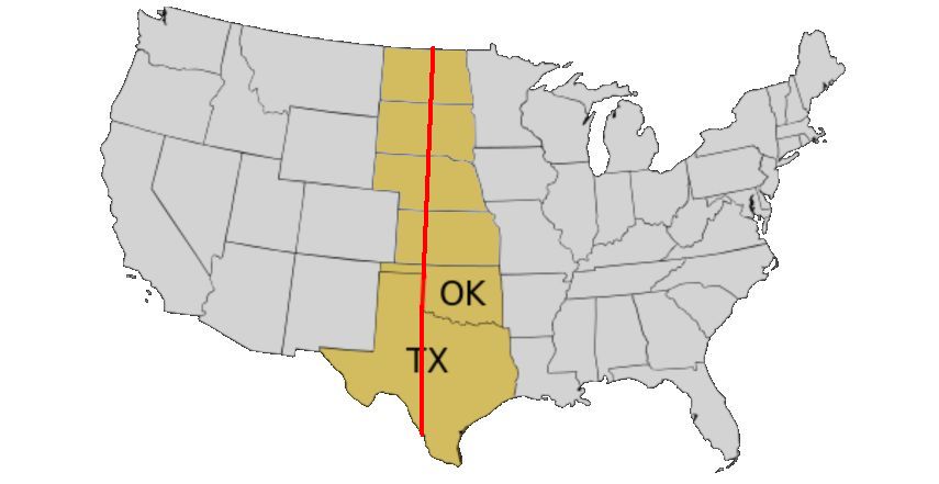
The 100th Meridian West is an imaginary line on the map that happens to mark the climate divide between the humid east and arid west in North America. Or rather, it used to. The rainfall divide is moving east.

Extending from the North to South Poles, the 100th runs longitudinally in the U.S. from North Dakota through Texas.

The 100th meridian is on the upright border of Oklahoma and Texas (image from Wikimedia Commons)

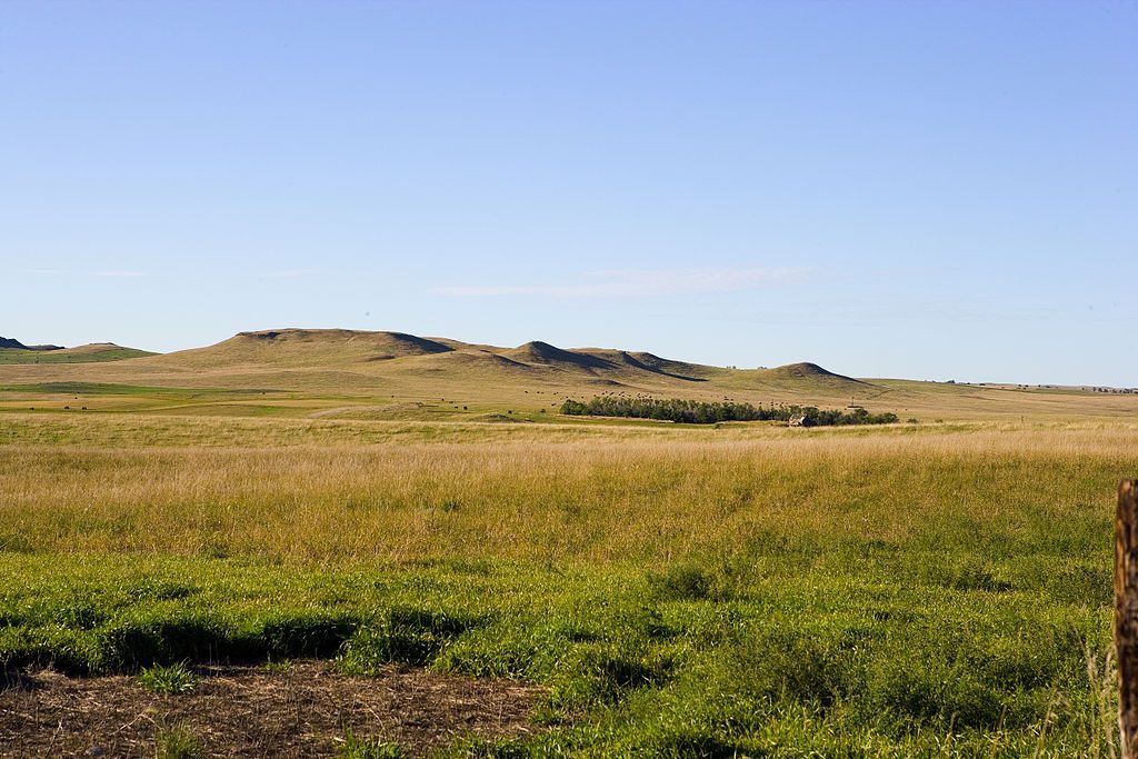
Its coincidence with the rainfall divide was first documented in 1877 by John Wesley Powell who found during his explorations in the Great Plains that the 100th was a visible boundary. Locations to the east of the 100th received 20+ inches of annual rainfall, the west received less.

20 inches is a key number for agriculture and human population. It determines what you can grow, whether you have to irrigate and, thus, how many people can live there. Powell saw the line and told Congress it had implications for settlement of the western plains. Congress didn’t heed him but …

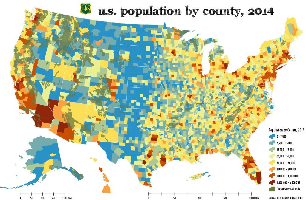
This 2014 map of U.S. Population by County shows that it played out as Powell expected. You can see the rainfall divide in population density. People choose to live where there’s water.

U.S. population by county, 2014 (map from US Forest Service)

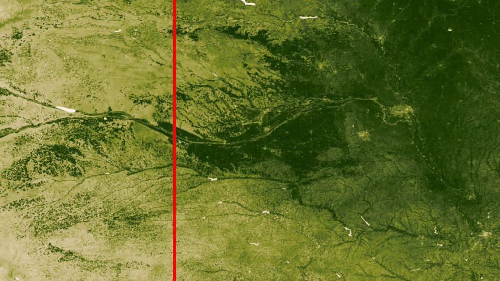
You can also see the line from outer space. I’ve marked the 100th (approximately) on this satellite photo of Nebraska. The landscape is deep green to the east though not uniform.

Satellite photo of Nebraska shows it is drier west of the 100th (photo from Wikimedia Commons)

Nowadays the 100th is no longer the rainfall divide.

A study by Columbia University meteorologists found that the aridity line has shifted 140 miles east and is now statistically located at the 98th meridian. Climate change will move it even further as warming evaporates moisture in the northern plains and alters rainfall in the south.

In a hundred years the aridity mark may be firmly inside Minnesota, Iowa and Missouri. Aridity decreases the amount of agriculture and will probably change the population. People choose to live where there’s water.

John Wesley Powell’s “100th meridian” is moving east.

This article was inspired by Yale Climate Connections. Read more here in Yale Environment 360, 11 April 2018.

(photos from USDA, USFS and Wikimedia Commons; click on the captions to see the originals)

Seeing Is Believing

Last year I learned that charts change hearts and minds better than words do. Our brains process visual information better than text.

I was reminded of this human tendency when I read in The New Yorker about the burgeoning Flat Earth movement. Members became believers when they saw YouTube videos claiming there’s been a coverup and that the Earth is actually flat.

This 2017 video sparked controversy as viewers tried to process his intent. Satire or Science?

Seeing is believing.

(video from YouTube; click the YouTube logo to see the original upload)

The Snowman Of The Universe

Three images of Ultima Thule, center image is black-and-white (photos from NASA / Johns Hopkins University Applied Physics Laboratory / Southwest Research Institute)

Last week the news broke that NASA’s New Horizons spacecraft had flown by and photographed what looks like the “snowman of the universe,” two icy chunks stuck together like a snowman and spinning out there in the Kuiper Belt beyond Neptune.

Yes, this object spins. Here’s a time lapse from NASA on New Years Day 2019.

Polar view of  Ultima Thule’s rotation over 2.5 hours (animation from NASA)

The snowman is reddish and tiny, only 20 miles long, so he can’t be seen from Earth. We wouldn’t even know about him except that a few years ago the New Horizons team looked for something interesting for the spacecraft to explore after it passed Pluto. They saw him as a dot using the Hubble Space Telescope in 2014 and chose him because he’s a classical Kuiper Belt object with low inclination and low eccentricity.

How eccentric is a snowman in outer space? It depends on his orbit.

NASA named his big chunk Ultima and his small one Thule. The combo sounds like a name from science fiction but in fact Ultima Thule was the name ancient geographers gave to the northernmost land in the inhabited world. Back then it was somewhere in Iceland, Norway, or a remote Shetland Island. Now it’s beyond Neptune. (Click here to pronounce Ultima Thule. It’s not what you think.)

Ultima Thule’s real name is (486958) 2014 MU69. It’s just the right number of digits for a phone number, but don’t call it. The long distance charges are astronomical!

For more information, including a diagram showing how the snowman formed, read NASA’s New Horizons Mission Reveals Entirely New Kind of World.

p.s. I’m sure Ultima Thule is not the only snowman out there so he’s actually “A Snowman” in the universe, not “The Snowman.”

(images from NASA / Johns Hopkins University Applied Physics Laboratory / Southwest Research Institute)

The Eye Of The Sahara

The Eye of the Sahara as seen from the International Space Station (photo from Wikimedia Commons)

While looking for something else I found … this beautiful eye of stone. It’s so large that it’s best seen from outer space, as shown in a photo from the International Space Station.

The Eye of the Sahara or the Richat Structure is embedded in the Adrar Plateau near Ouadane, Mauritania. It’s 25 miles across — the distance from Pittsburgh to Greensburg — so people couldn’t see its unusual shape until we could fly above it.

When photos came back from the Gemini space missions in the 1960s, the geologists went to work. At first they thought it was a meteor impact crater but meteors leave evidence behind and “the critical rock types failed to reveal a single feature attributable to shock processes. We, therefore, dismiss an impact origin for this structure. It must, instead, be endogenic.

Endogenic means “formed below the earth’s surface.” Indeed the Richat structure is a geologic dome, a magma bubble that hardened before it broke the surface then eroded away to expose the bubble’s onion-like layers. The youngest rock is on the outer edge, the oldest — 600 million years old — is in the center. The rust, blue, and white colors are the different kinds of rock.

Diagram from video showing how the Richat Structure formed (click here to see the video by Jeffrey Sonders)

This topographic reconstruction from satellite photos shows how the Eye is a bullseye bowl in the desert plateau.


Topographic reconstruction of Richat Structure using satellite photos, false coloring to show geology (image from Wikimedia Commons)

In the end, it’s visible because it’s in the Sahara. No vegetation covers it and the wind has blown all the sand away.

(images from Wikimedia Commons and a video by Jeffrey Sonders; click on the captions to see the originals)

The Mole Will Change in 2019

Drawing of hairy-tailed mole (image from Wikimedia Commons)

The definition of a mole will change on 20 May 2019. However, the mammal won’t change, the measure will.

Most of us don’t need to measure the number of atoms, ions, or other tiny entities in a sample of a substance so we’re not aware that the mole (mol) is the unit that does it. Its definition used to be based on 0.012 kilogram of carbon-12 but physical properties can change, so its size could change minutely and throw off precise scientific measurements. This troubled chemical engineers who use the mole extensively.

To fix the problem, the General Conference on Weights and Measures (CGPM) voted at their 16 November 2018 meeting to unlink the mole from its physical definition, redefining it using a mathematical constant. The new definition will be:

One mole of a substance will have exactly 6.02214076×10²³ specified “elementary entities” of that substance.

Wikipedia entry for mole (unit)

Three other measuring units had the same problem so the meeting redefined four:

  • Mole: the unit for amount of substance.
  • Ampere: a unit of electric current equal to a flow of one coulomb per second.
  • Kelvin: a temperature scale similar to Celsius but 0 degrees K is absolute zero.
  • Kilogram: the base unit of mass

Perhaps you’ve already heard that the kilogram will change on 20 May 2019. Originally defined as the mass of a litre of water, the kilogram (kg) was redefined in 1799 to be the mass of a block of platinum that’s stored in a vault in Paris. Even the platinum’s mass can change so now the kilogram will be defined by the Planck constant which was defined to be exactly 6.62607015×10⁻³⁴ kg.m2.s-1. As Wikipedia points out, “This approach effectively defines the kilogram in terms of the second and the metre.”

Notice that the second is raised to minus one, s-1. Is your head spinning? There’s a simpler explanation here in Popular Mechanics.

Meanwhile, why is a hairy-tailed mole (Parascalops breweri) illustrating this article if the message has nothing to do with him? Well, there’s no illustration for the ‘measure’ mole so I’m showing you the ‘mammal’ mole.

(image from Wikimedia Commons; click on the caption to see the original)

How The Mighty Monongahela Lost Its Crown

This used to be the Monongahela River (photo by Kate St. John)

Two million years ago the Monongahela was a mighty river.  Instead of being a short tributary of the Ohio and draining to the Gulf of Mexico, it flowed north to where Lake Erie is today and then to the Atlantic.  This stretch of the Ohio River in Pittsburgh was not the Ohio at all. It was the Monongahela.

Here’s how the mighty Mon River lost its crown and the reason why the Ohio turns south at Beaver, Pennsylvania.

Before the Pleistocene era, the Monongahela River drained 75% of today’s Ohio, Allegheny and Monongahela watersheds as it flowed north from West Virginia to the Lake Erie area (roughly the red arrow path below). 

Back in those days the Ohio River was just a tributary whose northernmost point was in Pennsylvania where it joined the Mon.  The Beaver and Shenango Rivers did not exist as they do today.  Their valleys carried the Monongahela north. 

Approximate flow of historic Monongahela River (derived from river maps at geology.com)

But then the climate changed. The Great Ice Age began.

Glaciers blocked the Monongahela’s northward flow so the river backed up and formed Lake Monongahela.  The pale dashed lines show the paths of our rivers today bending away from the prehistoric glacier.  

Lake Monongahela (image from Wikimedia Commons)

Eventually Lake Monongahela rose so high that it breached the lowest barrier in the Ohio valley near present day New Martinsville, WV (see orange arrow).

The Ohio started flowing “backwards.” It cut the Ohio River valley deeper, orphaned the northern Monongahela and reversed its flow, creating the Shenango and Beaver Rivers.

All of this was helped by the huge volume of water joining the Mon from the re-formulated Allegheny River watershed.  The Upper and Middle Allegheny river systems used to flow north too, but were also blocked by glaciers. Their proglacial lakes overflowed and joined the Lower Allegheny River flowing into the Ohio watershed.

And so the Monongahela River became a lowly tributary of the Ohio.

Climate change is big stuff.  When it gets cold it changes major rivers.  When it gets hot … Well, we’ll find out.

UPDATE: See the comments!  And here’s a map of the ancient Erigan River drainage from Ohio DNR.

(photo by Kate St. John. Red-arrow map derived from OH & PA river maps at geology.com, map of Lake Monongahela from Wikimedia Commons, annotated map of Erigan River via CVNP; click on the captions to see the originals)

Harlequins Warn of Mercury

Male harlequin duck (photo from Wikimedia Commons)

Some birds are canaries in the coal mine, telling us that something’s gone wrong long before we notice it.  Harlequin ducks (Histrionicus histrionicus) are performing that service in Alaska.

A 2017 study by the Biodiversity Research Institute looked for mercury in Alaska’s coastal waters by testing blood samples and molted feathers from harlequin ducks at Kodiak and Unalaska Islands. Blood samples were used because they indicate recently consumed mercury. Molted feathers show mercury when the feathers were formed a year before. 

The study found mercury in harlequins from both locations but those at Unalaska, midway in the Aleutian chain, had eight times more than those at Kodiak, nestled in the Gulf of Alaska. The study then tested the ducks’ main food at Unalaska — blue mussels — and found it there, too.

This is important news for Aleutian residents because they eat lots of seafood.  It also matters to the rest of us since Unalaska’s main port, Dutch Harbor, is the largest fisheries port in the U.S. by volume caught.  

Mercury apparently increases westward in the Aleutian chain. A 2014 study found mercury in fish above the human consumption limit at the western island of Agattu.

Where is the mercury coming from?  In the continental U.S. airborne mercury comes from coal-fired power plants and is regulated and reduced by the EPA.  It can also come from active volcanoes, obviously out of our control.

At this point scientists don’t know where the mercury is coming from, but China’s coal-fired industries are a good bet.  The prevailing wind in the Aleutian Islands originates in Asia more than six months of the year.

Winds over water in the Pacific and Bering Sea, 10 Dec 2018 (screenshot from earth “visualization of global weather conditions, forecast updated every three hours.” )

Unfortunately Alaskans can’t prevent mercury pollution that reaches them from Asia.  Meanwhile the harlequins warn of danger.

(photo of harlequin duck from Wikimedia Commons, screenshot of global winds from earth visualization website; click on the caption links to see the originals)

The Trees Are Still Standing

Camp Fire damage in a Paradise, California, neighborhood, Nov. 17, 2018 (photo by Senior Airman Crystal Housman, California Army National Guard)

In all the smoke-filled photos of the Camp Fire devastation in Paradise, California one thing stands out to me:  The buildings are gone but the trees are still standing.

The town of Paradise, California (population 26,000) was destroyed on 8 November 2018 by the Camp Fire, the deadliest and most destructive fire in California history.  As soon as it ignited at 6:30am, the fire raced westward on 50-70 mph winds. By 8am it reached the Paradise Town Limit six miles away. Seven towns were forced to evacuate but not everyone made it out. As of 26 November, 88 are confirmed dead, 203 are still missing and tens of thousands are left homeless.

But the trees survived.  You can see them in all the photos and videos including these taken on 17 Nov by the California National Guard as they searched the rubble and marked the damage. 

Soldiers from the California Army National Guard’s 649th Engineer Company, Chico, conduct search and debris clearing operations, Nov. 17, 2018, in Paradise, CA (photo by Senior Airman Crystal Housman)

Because the trees are still standing, the damage assessment has to be done by hand. This Washington Post article shows how the satellites can’t see through standing trees. 

So why are the trees OK in this incinerated landscape? I’m sure it has to do with moisture.

U.S. Army Sgt. Rodrigo Estrada of the California Army National Guard’s 649th Engineer Company, Chico, leads a team conducting search and debris clearing operations, Nov. 17, 2018, in Paradise, CA (photo by Senior Airman Crystal Housman)

Living trees contain more moisture than the dry wood in buildings. When blowing embers hit houses, they catch fire immediately. The trees’ moisture resisted. The fire moved on.

This video by Mike West shows how quickly fire consumes dry wood compared to living trees.

The scene is spooky now. Nearly everything is gone but the trees are still standing.


Soldiers from the California Army National Guard’s 649th Engineer Company, Chico, conduct search and debris clearing operations, Nov. 17, 2018, in Paradise, CA (photo by Senior Airman Crystal Housman)

p.s.  Some trees are damaged and will fall sooner or later.  Here’s an NPR story about trees in the fire zone.

p.p.s. See the damage extent on Cal-Fire’s Camp Fire Structure Status map.  See satellite images here in the Washington Post

(photos by Chico California National Guard, YouTube video by Mike West)

Why Don’t Birds Get Electrocuted?

European starlings on wires in Germany (photo from Wikimedia Commons)

In the winter huge flocks of starlings line up on the electric wires.  They even perch on un-insulated wires like those shown above. Why don’t they get electrocuted?

Here’s some helpful background: Electricity is the flow of electrons in a complete circle — called a “circuit” — that moves out from the power source, into our appliances, and all the way back to the power station.  The electrons flow in the path of least resistance.

If a bird steps in and connects the inbound and outbound electron paths it conducts the electricity through its body on a short(er) circuit.  Click here for a video that shows how circuits work.

Birds are safe as long as they don’t short circuit.  The video below explains the electrical reason why birds have to…

  • Touch only one wire. (videomark 0:28 to 0:47)  … and …
  • Not touch a wire and the pole simultaneously. (videomark 0:58 to 1:13)

Birds with long wingspans, like cranes and eagles, can accidentally touch two wires. Smaller birds that mess with the insulators (wire-to-pole connections) can also get electrocuted.

Electric companies prevent bird deaths and worker accidents by placing the wires far apart and increasing the gap between the insulators and the pole (wire-to-pole connections).

No one wants to be a short circuit!

(photo from Wikimedia Commons; click on the caption to see the original)

Fun With Spirals

Nautilus shell cut in half (photo from Wikimedia Commons)

Spirals in nature have a lot in common: Most of them are shaped like this nautilus shell.

Pine cones, flowers and hurricanes follow this same spiral pattern. Did you know they’re described by Fibonacci numbers?

On Throw Back Thursday have fun with spirals in this vintage article: Fibonacci.

Spirals on a pine cone (photo by Kate St. John)
Spirals in a sunflower (photo by Kate St. John)
Satellite image of Hurricane Katia, 31 Aug 2011 (image from NASA, MODIS Rapid Response System on Wikimedia Commons)

(photo credits: flower and pine cone by Kate St. John, shell and hurricane from Wikimedia Commons; click on the captions to see the originals)